Pamper the People
Even today, traditional gender roles remain engrained in our society and the products we sell. In the beauty industry, this is more true than ever: women's products are floral & feminine and the men's selection looks like power tools.
DesignBridge's 2016 D&AD brief challenged me to create a beauty brand for the younger demographic that can no longer relate to these traditional gender ideals. Creating something that reflects their inclusive values and activist ideals.

From research I found that Pamper products are always designed to be ultra-feminine, excluding other gender identities. The products are marketed as indulgences, However they provide so many more physical, emotional and mental benefits that go way beyond spoiling yourself.

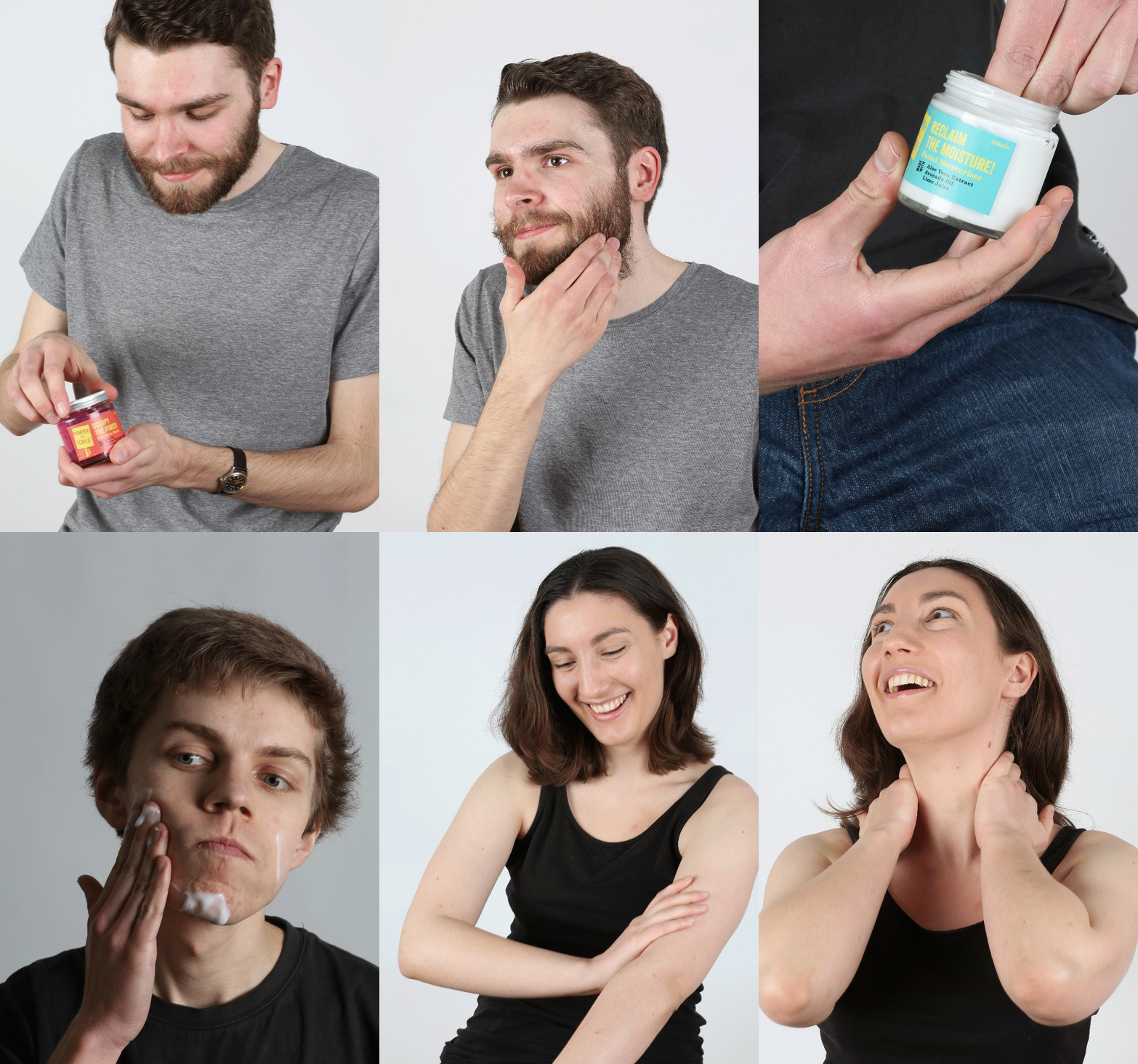
Pamper the People is a brand that seeks to disrupt the the beauty market, shouting about how their products should be for everyone regardless of how they look, how they identify and who they fancy. With a protest-inspired aesthetic & language the brand strikes the balance between irreverent and socially responsible.

The brand marques are all screen-printed to give the brand a rough, handmade feel that wouldn’t be out of place at a rally.

The brand has a range of three unisex products - face masks, body lotion and moisturiser. The packaging has a deliberately rough, protest feel with screen-printed cardboard boxes, simple sticker seals, and up-cycled glass containers.


Pamper the People would have a stripped back presence online, cultivating the brand image as an underdog among other beauty giants.


Pamper the People stays true to the protest aesthetic by mainly relying on analogue flyposting & stickers to spread the word.


When launching the brand, a pop-up shops would help get the word out, and give shoppers the chance to pamper themselves proudly, or even just for the first time.

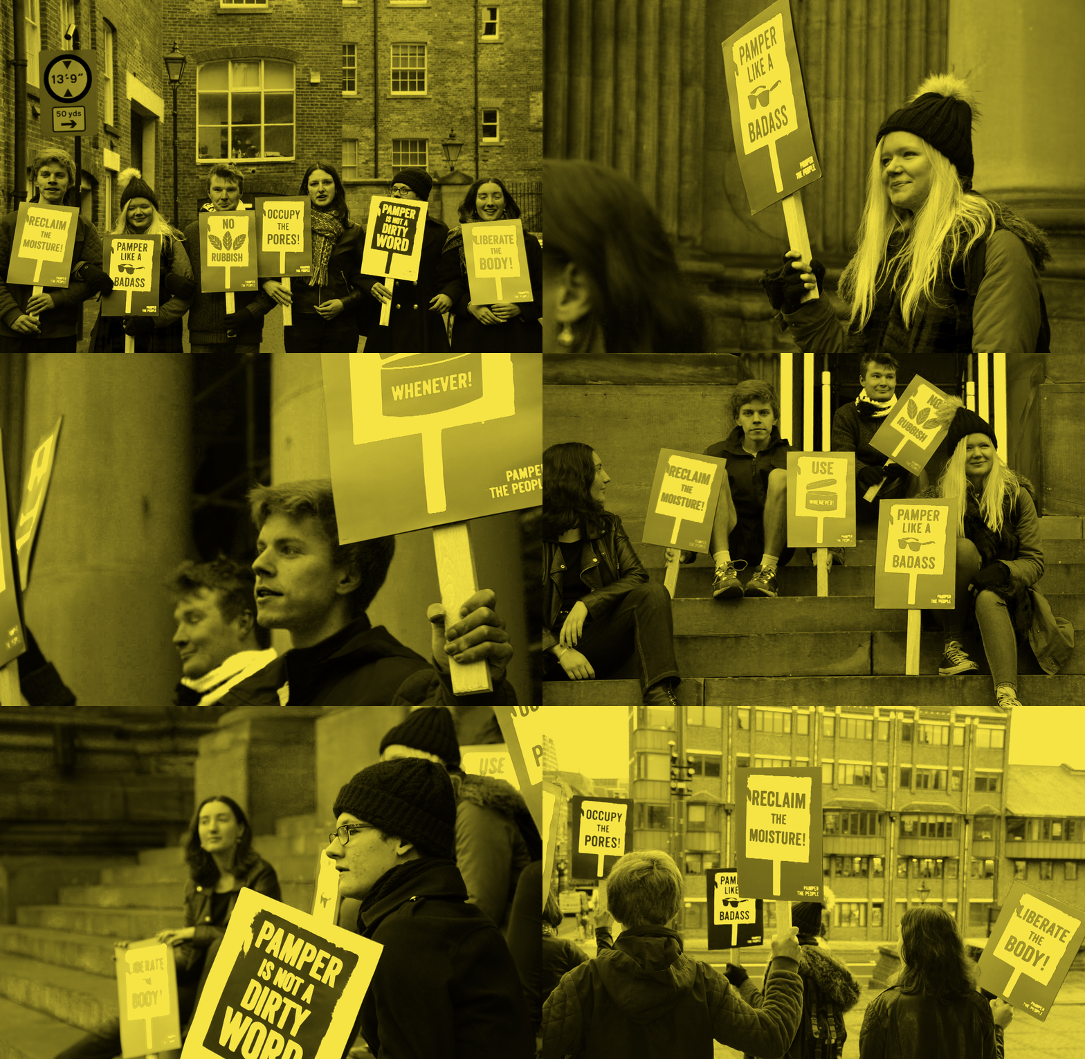
A "Pamper Protest" was staged in Leeds Town Centre as part of the promotional website material, with protesters fighting for the right to pamper!
